Tremor Design System Samples
This project focuses on developing a unified and scalable Design System for digital products, ensuring consistency in visual design and user experience. The system integrates key components such as color systems, typography, font guidelines, layout variations, and elevation styles. Each element was crafted and documented with precision to align with branding and usability goals.
The resulting design system provides a robust framework for creating cohesive and scalable digital experiences. Each element is meticulously designed and documented to ensure ease of use for designers and developers, promoting efficient collaboration and adherence to branding guidelines. These are only a few samples of the whole project.
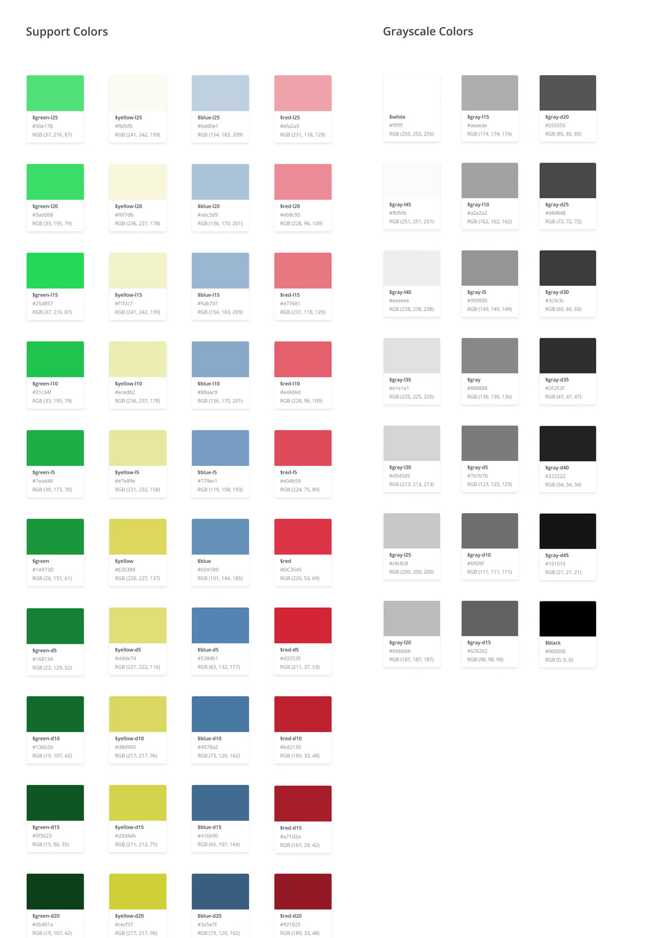
Color System: I developed a structured palette of support colors, including green, yellow, blue, and red, along with a range of grayscale colors. Each color swatch is accompanied by detailed information, such as names, hex codes, and RGB values. The palette is logically organized to effectively accommodate both brand identity and accessibility standards.
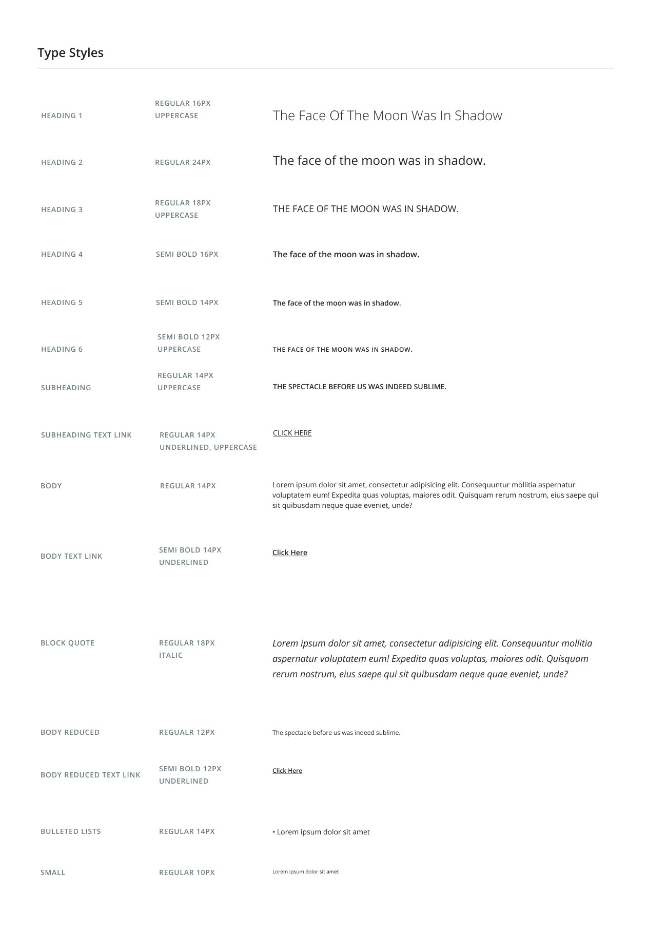
Typography Styles: I developed a Type Style Guide that establishes consistent text styles for headings, subheadings, body text, quotes, and links. The guide includes variations in font size, weight, decoration, and casing to accommodate diverse design requirements. By ensuring legibility and harmony across text elements, I aimed to enhance readability and visual appeal.
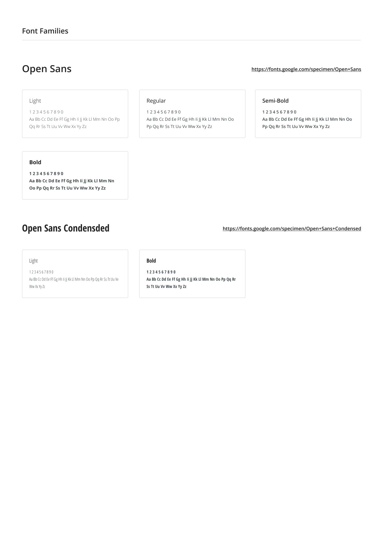
Font Family Guide: I selected and documented two versatile fonts: Open Sans and Open Sans Condensed. I specified the available weights and styles for both fonts, demonstrating their application through numeric and alphabetic examples. Additionally, I ensured seamless integration of these font families to maintain branding consistency.
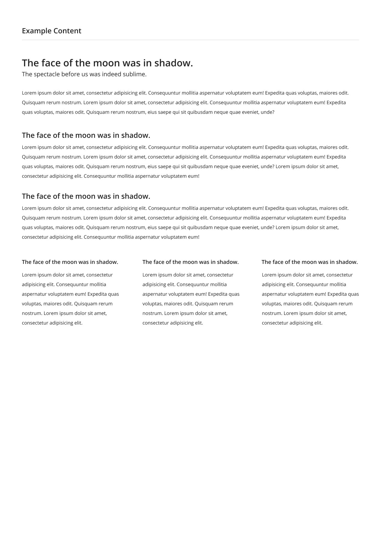
Typographic and Layout Variations: I explored various layout designs to assess readability, alignment, and spacing. A range of options was provided, including full-width content and multi-column layouts, allowing for adaptation to different use cases. The focus was on optimizing the user experience through effective visual hierarchy and text arrangement.

Elevation Styles: I defined six distinct elevation levels, ranging from $elevation-1 to $elevation-6, to represent shadow and depth in UI design. Each level features a minimalistic display that emphasizes the progressive nature of the elevation effects. Additionally, I standardized these elevation styles to ensure consistency across both interactive and static components.
