USB Design System Samples
This project focused on creating a robust and flexible design system, centralizing essential design tokens and visual guidelines to ensure brand consistency, scalability, and accessibility across digital products. To design and document a system of reusable components and variables, enabling seamless collaboration between designers and developers while ensuring a cohesive user experience across multiple brands and platforms.
This project delivered a robust, scalable design system that acted as the backbone for brand and product consistency. By combining a structured color system with centralized Figma variables, the team empowered designers and developers with a unified framework, enhancing productivity and design precision. The result is a flexible, future-proof system tailored to meet the needs of evolving products and platforms. Note that these are only a few samples of the whole project.

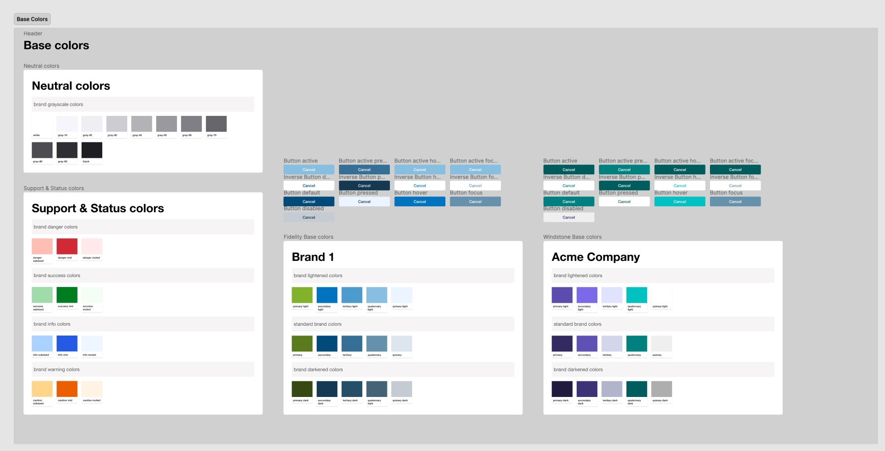
Building a Color System: A meticulously crafted color system serves as the visual foundation for UI/UX elements, utilizing neutral tones as a universal palette. It incorporates dedicated colors for system feedback, including shades of red for errors, green for confirmations, blue for informational messages, and orange for cautionary cues. Additionally, the system features brand-specific palettes with various color variants and defines interactive button states to enhance usability and ensure both accessibility and consistency across different brands and platforms.

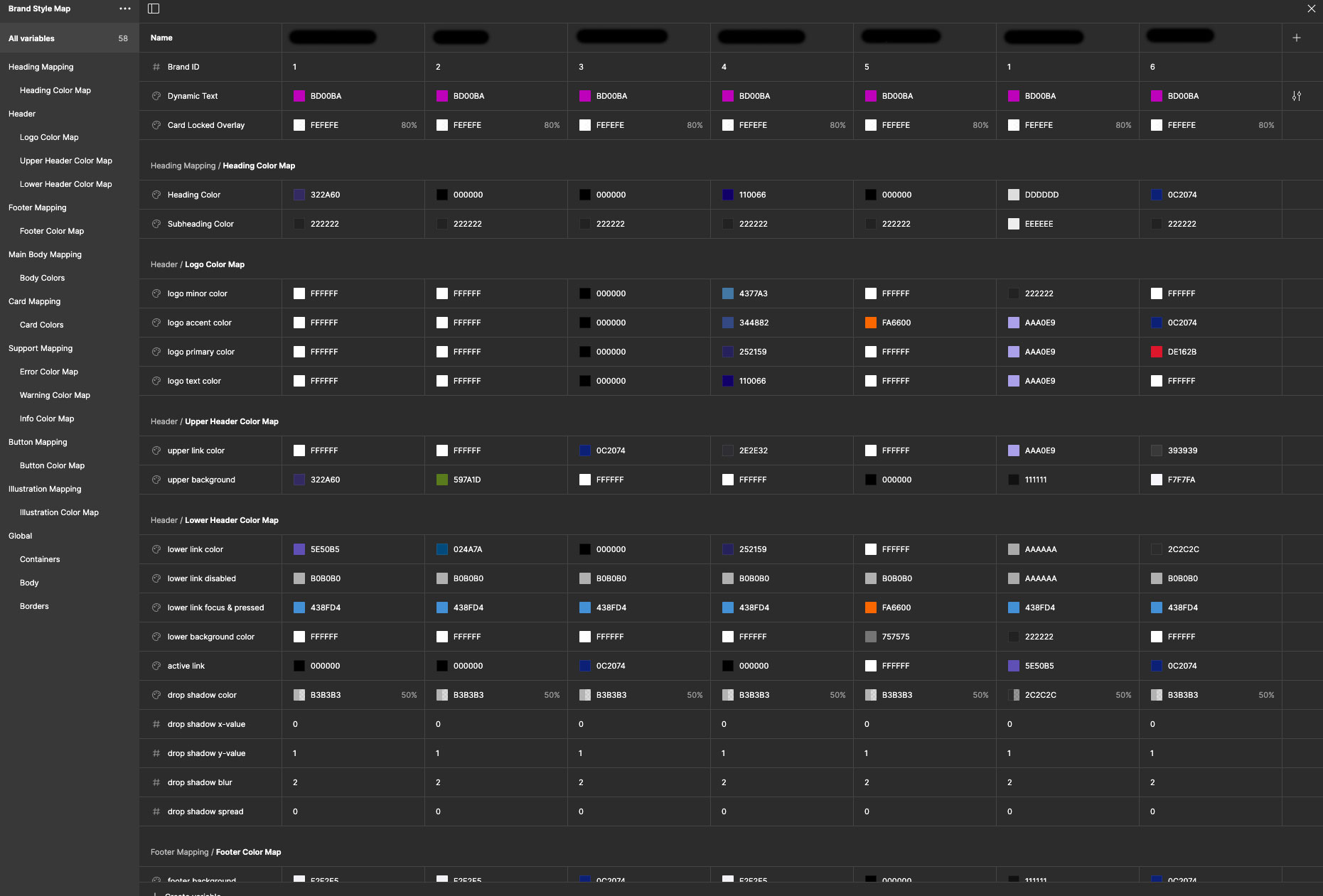
Variable Management in Figma: A carefully designed color system establishes the visual foundation for UI/UX elements, using neutral tones as the core palette. It incorporates specific colors for system feedback, such as red for errors, green for confirmations, blue for informational messages, and orange for warnings, while also including customized palettes for individual brands. Furthermore, the system outlines interactive button states to improve usability and maintain a focus on accessibility and consistency across various platforms.
